
Excel reporting dashboards: how to make them work for you
03 Jul 2019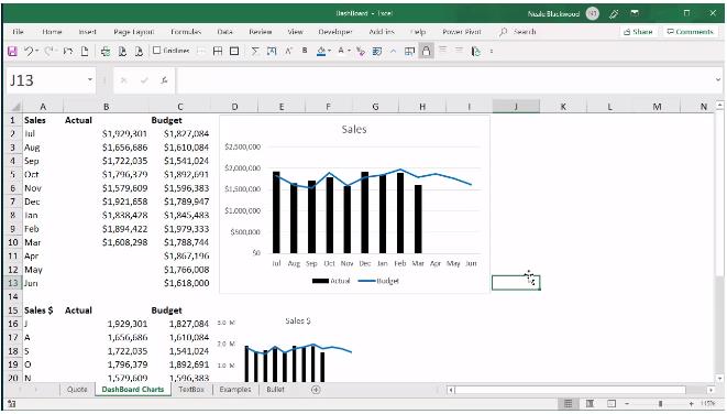
Dashboard charts need to save space and convey a message. There are techniques you can use to create effective small charts. Microsoft has a dashboard application called Power BI. This works well with Excel, but is a separate package. If you are creating many dashboards, Power BI may be a better solution than Excel. There are a number of techniques you can use to create small charts in Excel.
These include:
- centralised legends and consistent colour coding
- centralised titles using cell entries or text boxes
- removal of unnecessary lines
- using simple charts like column, bar and line charts
- including labels instead of axes
- using abbreviations for values and months
- chart templates
- maximising the screen area
Figure 01 demonstrates a few of the techniques discussed below.

Figure 01.
Centralised legend and titles
Depending on your dashboard structure, you may be able to use consistent colours and a single legend. For example, actuals are always shown as black and budgets as blue.
Colour warning
Just a reminder that using red and green on dashboards (e.g. traffic light reports) has risks for colour-blind readers. Blue is a safe colour. Also, don’t use too many different colours on a dashboard as it makes it gaudy and harder to read.
You can use thick lines on the dashboard to create sections and have specific headings/legends in those sections. Headings for Month and Year to Date can enable you to exclude those words from the chart titles. The fewer characters in the chart title, the better. Including $ in the chart title means you can exclude it from the axis.
Text boxes can be useful for headings because they float above the grid and can be placed anywhere. A text box can also be linked to a cell to enable flexible headings.
To link a text box to a cell, select the text box, then click inside the Formula Bar, press the = key and then click on the cell you want to link it to.
Note: if you type text into a text box, you have total control over the formatting. If you link to a cell, then you are limited to a single format for the text box.
Removing lines
Removing lines doesn’t save any space, but it does make the chart cleaner and easier to read. The common lines to remove are gridlines and axes lines. You can also remove the lines around the chart area and the chart itself.
Simple charts
Line, column and bar charts are the most familiar and easiest charts to read and understand. More complex charts tend to be difficult to make smaller, e.g. a waterfall chart.
Avoid using pie or donut charts as these use a lot of space and don’t display much information. A 100 per cent stacked column or 100 per cent stacked bar chart achieves the same result using less space.
Avoid using gauge charts as they take up a lot of space to report on only a few values. Consider using a bullet chart, which I have covered in a previous article – search Bullet on the INTHEBLACK website.
Use labels instead of axes
Sometimes a vertical axis can be removed if labels are added to the chart. In a dashboard, trends and relationships are as important as the values themselves. Some charts can have their axes removed and still convey a meaningful message.
Abbreviations
Using single letters for things like months and days is acceptable on a dashboard. You can retain readability by using sequences like J A S O N D J F M A M J and M T W T F S S.
If you are referencing large values, round them off to thousands or millions. Reduce the number of characters required to display a number. $1.5M is preferred to $1,500,000.
Chart templates
Once you’ve created your small chart, you may want to save it as a chart template to enable you to make more of them faster. It can take time to create a small chart because you are removing so many parts. Chart templates can speed up the process of replicating the chart.
To save a chart as a template, right-click the chart and select Save As Template. In older versions of Excel, the Save As Template option is on the Design ribbon tab. This tip applies to creating all charts, not just dashboard charts.
Trial and error
Don’t be afraid to remove parts of a chart to see the result; changes can be easily undone. Creating dashboards can be an iterative process, especially in development, so be willing to try different things.
Maximise screen area
There are techniques you can apply that maximise the amount of screen space you have to display charts. You can toggle between displaying and hiding the ribbon (top of screen) by using the keyboard shortcut Ctrl + F1.
On a sheet-by-sheet basis, you can remove the headings, e.g. the column and row headings. This provides a slight increase in the screen size. These settings are in the View ribbon tab (see Figure 02).

Figure 02.
The View ribbon tab also has the option to hide the Formula Bar (above the grid). This provides a slight increase in screen area. Unfortunately, this setting applies to the whole workbook, so it may not be applicable if you need to see the Formula Bar to do your work.
There is also an option to maximise the screen area using the full-screen option. This could be useful if you are doing a presentation with the dashboard. The keyboard shortcut to display full screen is Alt V U pressed in sequence, not held down. Press Esc to return to the normal screen.
The companion video and Excel file will go into more detail to demonstrate these techniques.
Neale Blackwood CPA runs A4 Accounting, providing Excel training, webinars and consulting services to organisations around Australia. Questions can be sent to a4@iinet.net.au
One piece of advice
"Perfection is achieved not when there is nothing more to add, but when there is nothing left to take away.” Antoine de Saint-Exupery